
The artists on the front cover Ellie Goulding herself has shimmery golden lights in her hair, which links in with the album, name ‘Lights’. The close up shot of her face allows audiences to see her facial expression and the light tinted make up she have used which links with the album name. We could argue that Ellie Gouliding’s pose; her hand behind her head and looking away is vey enchanting suggesting that the magazine is aimed at male audiences. However it is evidence that the magazine is not only aimed at male audiences, as the magazine looks also very natural highlighting femininity therefore attracting female audiences. The colour used throughout the magazine is mainly gold, which has connotations of wealth, innocence and royalty. Perhaps this colour could be linked to Gouldings luxurious life style and her innocent and royal personality. In addition, it is also similar to her surname ‘Goulding’. On the bottom of the poster audiences can see the logo of the record label Goulding is signed too. This record label is well known therefore this makes Goulding more appealing towards the audiences as she has a contract with a well known record label company who also has signed contracts with other famous singers. The typography used for the letters ‘E’ and ‘G’ is quite curvy and different from the rest of the typography that has been used. This gives it a sophisticated look which links in with the overall image of the magazine. The other typography used is quite simple and straightforward making it easy for audiences to read. The website on the bottom of the page will be useful for audiences who want to find out more about the album as they can visit the link provided. The quotes on the magazine are from the Q magazine and The independent this shows that Goulding’s magazine has been rated by well known magazine companies so therefore audiences can trust and purchase the magazine as the opinions will reflect of those who know a lot about the music industry.
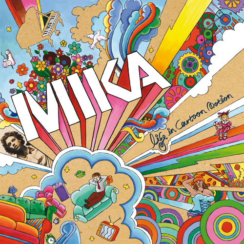
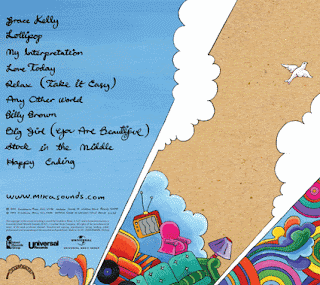
This CD cover has used a lot of bright colours to show that the genre of this album is clearly pop. In addition the colours also highlight happiness and fun adding to the connotation of a pop genre. Mika’s name has been written on the centre of the page in big bold typography in order to make audiences aware that the album is of Mika, a well-known artist. Also a small picture of Mika has been included however the colour of the picture looks different from the overall CD cover, as a sepia effect has been used. This has been added to attract audience’s attention and make his image stands out and show people who’s artists album cover it is. The name of his album ‘’Life in Cartoon Motion’ is typed up in a different typography and much smaller than Mika’s name however it still links in with the cover as it goes well with the whole cartoonish image/theme. Furthermore, we can see that the cd cover has been aimed at different age ranges as the bright colours and the doll suggest that the cover is childlike aimed at young people however the man in the suit sitting on the bank suggest adulthood making it appeal to a older audience. Making it appeal to different age range will attract a lot of mainstream audiences. The pictures that have been used might show Mika’s artistic side and portraying him to be fun (i.e flowers,tv,bright colours) as well as music talented (i.e paino image in the corner). The back cover of the CD runs the same theme as the front for example the titles of the song are written in the same typography as what the album title 'Life In Cartoon Motion' is. This is probably done to make it easier for audiences to recognise who the album belong to even if the back cover was seen before the front. Website has been included in order for audiences to find out more information about the album if they need to. Overall, we could argue that the CD covers clearly connotes the pop genre by using creative images and bright colours suggesting the songs within the album will also have high production values.

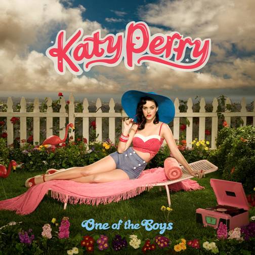
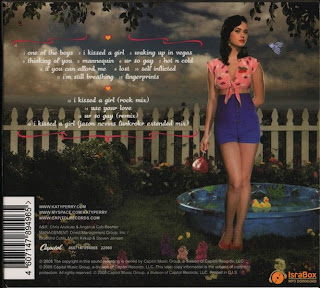
This CD cover compared to Mika’s front cover looks more simple and straight forward however it still has a lot of connotations of the pop music genre. For example the cover consists of different range of bright colours i.e red, blue and yellow, suggesting fun and happiness. We could argue that the front cover has targeted successfully male and female audiences in order to get a mainstream audience to maximise the albums profit. The pink colours and her outfit would attract female audiences as they would envy and emulate her stylish clothing whereas the blue colour of the albums name ‘One of the Boys’ contrasts with the feminine representation and her revealing clothes and pose would attract a lot of male audiences. Her sweet and playful look suggests that the album is aimed at young people most likely teenagers. In addition, the pose she makes looks very glamorous suggesting that the album is also aimed at a high-class audiences, as they will be able to identify and relate to her. The typography of her name is in bold big pink letters with an outer line to make it more stands out and eye catching towards audiences. Audiences will be able to recognize by who the album is song as her name is mainly in the center of the page therefore can’t be missed out. The mise en scene, which consists of a sun bed, record player, white fence and flowers, represents a typical British 1950’s garden. In addition also the straw head she is wearing and here pink crop top, blue waisted shorts and red wedges all add to the 1950’s look however it has been modernized in order to fit in with today’s society/fashion. This theme is been used in order to attract older audiences who would be able to identify with the 50’s theme. The back cover of the album still runs the same theme (1950’s theme) to show that the front and back covers are part of the same album. The long shot of Katty Perry allows the audiences to see her figure, which adds to her feminine features as well as her red lipstick and long legs. Again her pose and revealing clothes would attract the male gaze as she shows off her womanly features. The mini paddling pool with rubber ducks could suggest that the back cover of the album also run a funfair theme as the it could represent the duck joking game that is mainly played by young audiences when visiting funfairs. The fact that she is holding a lollipop in her hand is also another feature that is associated with going to the funfair and having fun. Similar to Mika’s back cover also Katty Perry’s back cover includes a website where audiences can find more information about the album if they need to.


This background of Rihanna’s album ‘Good Girl Gone Bad’ is quite simple and straightforward with only the artist on the front cover portraying class and elegance. Her name is in big bold turquoise letters in the center of the page in order to show by whom the album is song. The fact that the artist name is in the middle of the page is eye catching and would attract audience’s attention. In addition, because her name stands out, it puts more emphasize on the artist herself and who she is, as the rest of the album is in black and white. The name of the Album is ‘good girl gone bad’ she has used alliterations of the letters ‘G’ to make it easier for audiences to memorise the album name. The album name could also suggest about the situations/life story that Rihanna had to go through in order to become a famous artists. The artist pose is quite sexual and appealing, which would attract a lot of male audiences. However, also females would be attracted to the album as young girls would envy and want to emulate her in the way she looks. Brighter lighting has been used round Rihanna’s image in order to make her and her outfit stand out and emphasise her importance on her front cover.

The same black and white theme runs throughout the back cover of the CD with again a brighter colour used in Rihanna’s image. The song titles of the album are in turquoise in order to make them stand out and allow audiences to see what songs are included in the album. The fact that a lot of black and white colour is used could be that the colour black connotes the ‘bad girl’ and the white colour connotes the ‘good girl’ which links in with the Albums name ‘Good girl gone bad’. Furthermore, also institutional information has been added on the back cover of the album in order to give audiences a little bit of more information about the album and who produced it. Rihanas make is quite simple and straightforward which is associated with R&B fashion therefore we can point out that the album is part of the R&B music genre.
No comments:
Post a Comment