This video shows the lead singer lip singing along with the song. As you can see the lip singing looks very unprofessional and his body language does not match the 'up to beat' song. Therefore, we decided take this scene out and instead use random people singing along with our song to make it more enjoyable for audiences to watch. In addition, the location of this scene wasn't good as it was recorded in a classroom.
Thursday, 29 March 2012
production log
Yesterday we recorded our 'band scene', and today tried to apply the scene to our music video, however once we replayed the music video with the footage of the band included we realised that the acting/posing/lip singing of the band members wasn't at the same standard as the rest of the footage. Therefore, we decided to take the band scene out of the music video and record random people singing along with our song. This was quite difficult as we had only a few hours to get this done yet we managed to get few people willing to take part of the music video. Once we record them singing along with the song, we quickly uploaded everything to Adobe premiere, hopefully we will finish the music video by tomorrow.
Production Log
Finally research and planning/ancillary tasks are completed, our group is now focusing to get our music video finished and then focus on the four questions for evaluation
Wednesday, 28 March 2012
Production log
Today we made some changes to our ancillary tasks because we realised when putting them together that we did not meet the criteria of brand identity, therefore we decided to change some parts in order to gain the full marks. In addition, we worked on our music video as yesterday we toke videos of the band scene and today we tried to import that into the music clip
Creating inlays


In order to make the red stand out more we had to keep the hue levels the same however, increase the number of saturation levels and decrease the number of lighting levels.
This progress has been repeated several times as we had to change the colour of Jordan’s jacket (middle) as well as darken the t-shirt of Ankit(right) and change the colour of Klevis’s jeans.
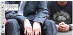
We wanted to make the band members stand out so therefore we decided to blur the image and then make it black and white. This will attract audience attention and more importance will be placed upon the band members. In addition, because they are called ‘The Colours’ we believe this effect will link in successfully to tie in with the band’s name. One of the band leaders wore a t-shirt with guns and roses logo which we somehow had to get rid of because it was advertising another well-known band and we did not have time to reshoot the photos. Therefore, we decided to change the logo to black and white by decreasing the levels of saturation and then smudge in the roses so that the logo would not be apparent anymore.


Another idea was to make the band members look cartoonish by using fliter, artistic and then selecting poster edges and placing the bands name and album name on the left hand corner with the letters being in different colours however once creating this image we did not like it because it looked like as if the band was aimed at a audience younger than 15 therefore we rejected the idea.

This is the picture of the one of the final inlay covers:

For the second in lay we wanted to use the pictures of the band members looking down to the camera. While working on this idea we realised that we had to change Ankits t-shirt with the guns and roses logo. We tried to change the logo by placing over a circle with bright colours painted on a canvas in order to tie in with the bands name and album name however that did not seem realistic as the image was token from internet and did not blend in with his t-shirt. Another problem we faced with using this picture was that cropping out the band members and placing a nice blue sky behind them it was obvious that the background was fake and did not portray a natural look therefore we rejected this whole idea and instead used a different image.


We chose the image we toke in the studio, the reason why we chose that photo is because we wanted them to portray a natural look, we chose to apply the same effect as the first inlay in order to show brand identity.

Tuesday, 27 March 2012
changes to back cover


We decided to make some changed to the back cover as we realised that it does not tie in with the magazine advert. One of our media teachers, she told us that the yellow stands out too much and does not link in with the other colours so therefore we changed the yellow colour to white. In addition, we put a black stroke around the white letters in order to make it more stand out.

Sunday, 25 March 2012


Friday, 23 March 2012


Subscribe to:
Comments (Atom)